How Many CTAs Should You Include in An Email?

All of that effort, all of that time (well, unless you’re using ahoy!), spent curating campaigns and building your outreach strategy. Oh, right, it’s because you’re trying to engage your customer base to interact and make purchases. But no matter how cute or crafty your message may be, you won’t see conversions without a strong CALL TO ACTION.
So… what’s a CALL TO ACTION good for, anyway?
Well, simply put, it tells your reader or viewer exactly what you want them to do. Getting more detailed, a call to action (CTA) is a direct B2C message in an advertisement whose purpose is to spur a customer into a desired behavior, often by creating uncertainty or fear of loss around the message. These CTAs can take several forms; linked text, images, even a gif, but most importantly, the button. The button allows the recipient to navigate directly to a purchase in one single click, making it the most efficient CTA.
For the most part, there aren’t any hard-and-fast rules around using CTAs, other than maintaining clarity through your entire message. Maintaining clarity is of the utmost importance; if your readers are taken through a maze of wishy-washy, unconvincing prompts instead of directed to a clear CTA, they’re going to (understandably) convert at a much lower rate. Making sure your readers know what you want from them is paramount. So logically, the next thing you might ask is…
“How many CTAs or buttons should go in any given email campaign?”
Good question. It’s one we get a lot around here, and, like many things in creative marketing, doesn’t have a firm or concrete answer. Of course, there’s no one-size-fits-all solution for every company and campaign, but for ecommerce email marketing, we say the fewer the better. If for no other reason, sticking to just one clear CTA will reduce confusion among your recipients and simplify where possible, and make each individual message stronger and more pointed. Sticking to your message and making it as clear as possible is a strong start to any campaign.
“So, where should I put my CTA?”
Another great question! This one probably seems simple, but let’s not get ahead of ourselves here. The obvious answer is “IN THE MIDDLE OF THE PAGE,” but it’s not quite that easy. One point to keep in mind is that viewers will read the text from left to right, and top to bottom; consequently it makes the most sense to put your actual CTA button either on the bottom of the text, or, especially if the button moves with user scrolling, on the right-hand side of the text. However, what’s most important is still clarity.
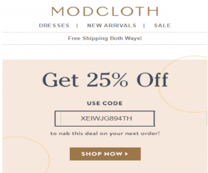
For example, take a look at the email below from Modcloth (left), and another unnamed brand (right). Each company takes a completely different approach with its own CTA. Modcloth’s entire design is focused around a single CTA (which is a simple directive, “Shop Now”) located directly under a large discount announcement. Needless to say, it’s pretty hard to miss. Our mystery brand gives multiple options; they focus on their product, using their variety as the CTA. Admittedly, this method is less direct, but sometimes, multiple options can be enticing. Which email are you more likely to click?
 Even if the images on the right contained a clear button saying “‘Shop Now” under each of them, the design would likely be too busy and overwhelming. Options can be nice, but sometimes, they’re too much, and overwhelm the viewer. Have you heard of the Choice Paradox? In the face of too many options, people can become paralyzed, ultimately making no decision at all. That’s the exact opposite of what a CTA is meant to do!
This doesn’t mean you have to take away choices from your recipient- just make sure you guide them to make better ones! For example, you can link them to one action, “Shop Now,” which drives them to a landing page of your most popular collections. Think of your emails like funnels; each CTA points your readers in the right direction by focusing the designs and honing in on one desired action. This doesn’t mean you can’t include multiple products, or create multiple CTAs (However, strongly consider it, because emails with one, hyper-focused call to action can increase clicks 371% and even more impressive, sales increase by 1617%.). It only suggests that you make sure every email sent out has a clear purpose and a strong, effective, and efficient CTA that points the readers where they need to go.
Our call to action? Use ahoy! and never worry about your email templates again.